
photo app redesign for reliving memories
Helping less tech savvy users reconnect with cherished memories, by reducing mental effort through simplified photo navigation
Role
UX designer (including: Prototyping, visual design, interaction design, motion design, usability study)
Tools used
Figma: for UX design (wireframes, prototypes, and design systems)
CoPilot: for characters in the user story
Canva and Material Design : for visuals and iconography

Project goal
This project reimagines a photo app, by simplifying how users organize, find, and interact with their photos, specifically for users who are not tech savvy. The design enhances the user’s ability to relive and enjoy memories and experiences with their loved ones.
Key Decision: Shift from feature-heavy navigation to intent-based flows
Tradeoff: Reduce number of loaded photos in a single screen for improved usability
Impact: Increase photo interaction, enhance user experience and their ability to relive and enjoy special moments
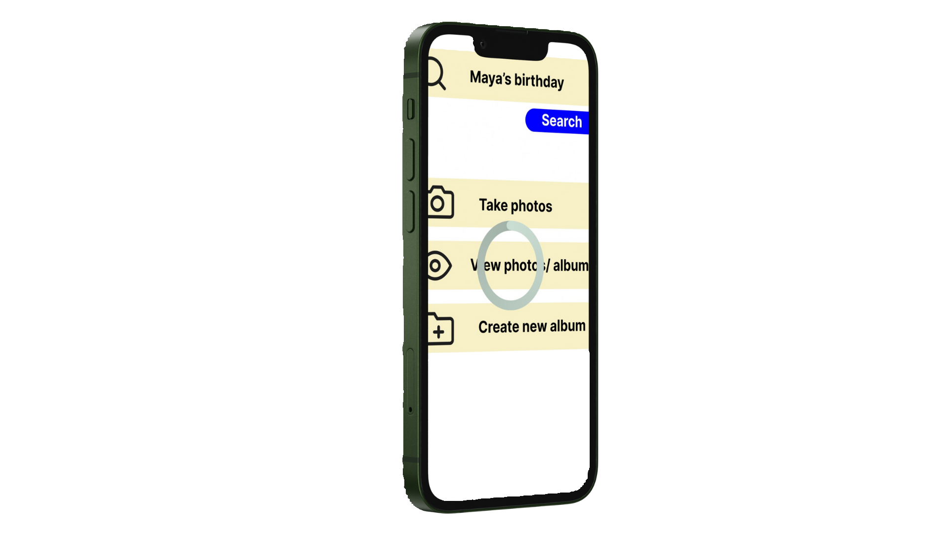
Objective: Redesign a photo app to be more accessible for less tech savvy users, by organizing high number of photos and helping them find specific memories quickly.
Audience
• Non tech savvy users
• Users who value simplicity and effectiveness
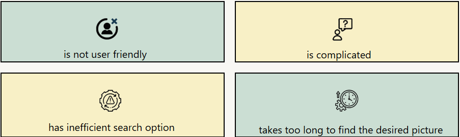
Pain Points
The photo app…
Design Process
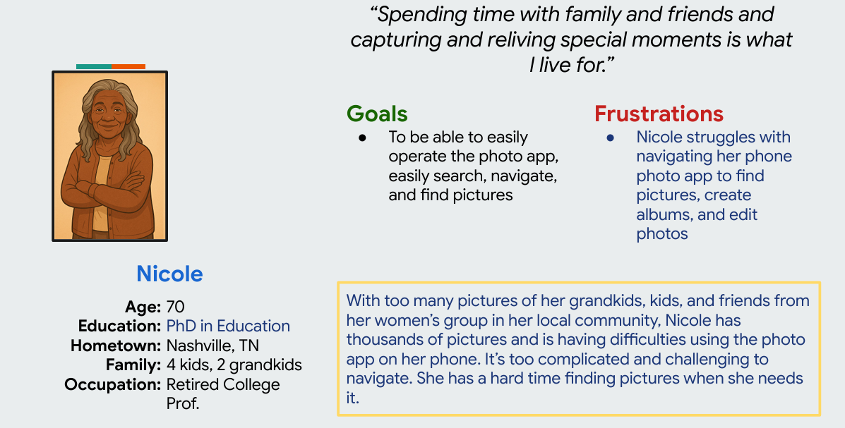
Based on all of the user research feedback on the current photo app, I decided to narrow then my focus on Nicole, as she represented the consensus of what the users said, felt, and thought about the app. Nicole was the primary user persona for the design process.
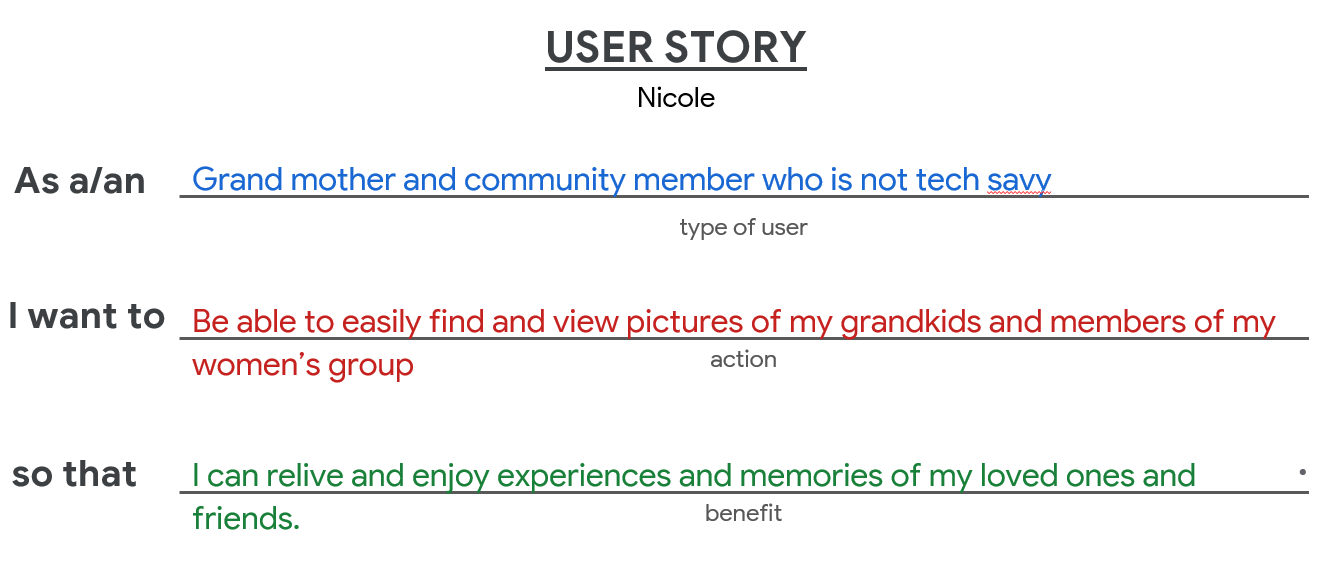
User Story
Journey map
I mapped out every action, task, and anticipated feeling I wanted Nicole to experience with the new design. I also added improvement opportunities that can enhance the overall user experience.

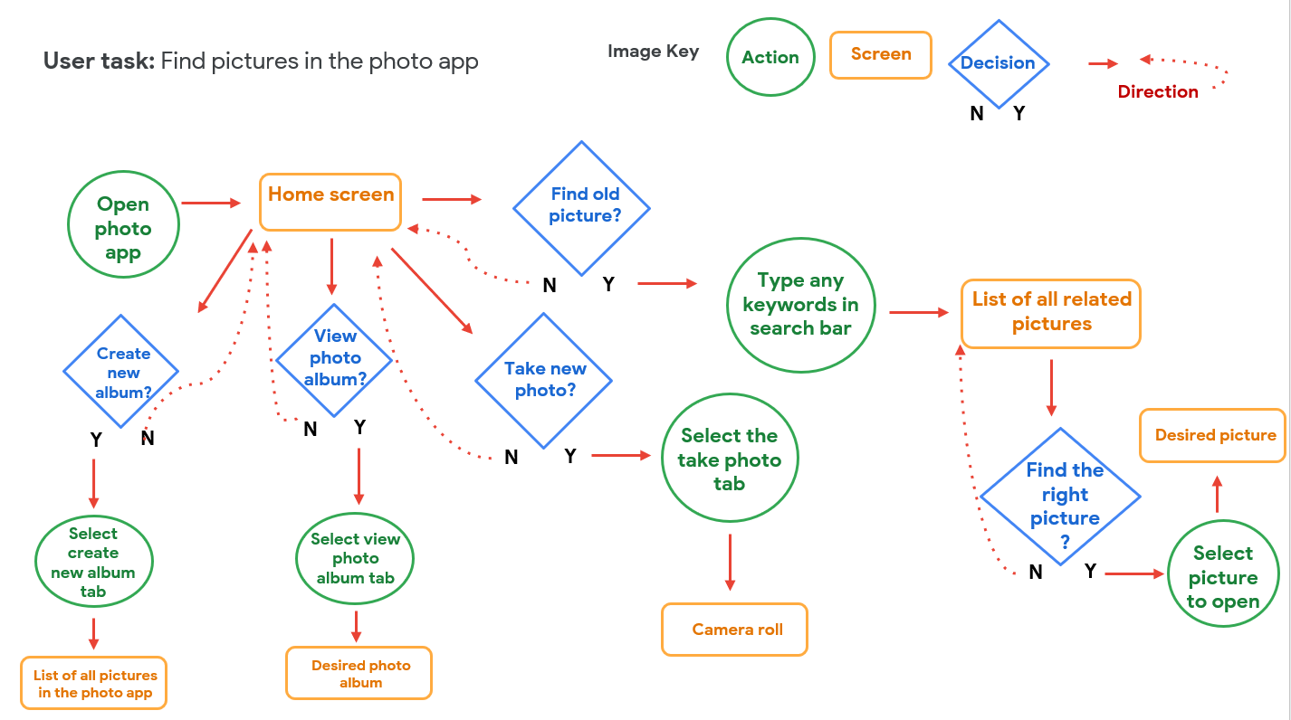
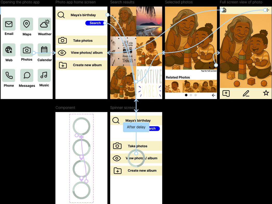
User flow
I outlined the way I wanted the user experience to flow, from starting point to the end result- highlighting relevant screens, decisions, and paths, to help me start the design process.
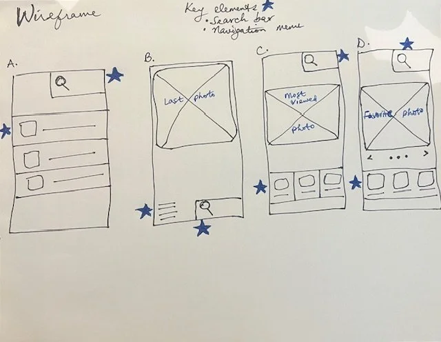
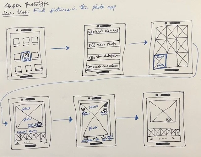
Wireframes, Mockups, and Prototypes
Using the journey map and user flow, I started out with storyboards and wireframe sketches. After deciding on the right path for the users, I created prototypes and mockup, and a design system in Figma. I effectively used interactions, iconography, animations, and design system to create an accessible and effective user experience.

Usability study
-
![]()
Liz- 45 year old female counselor
1st attempt (unmoderated) Time: 49 seconds
Task Completition: easy to complete
Observation: initially confused, very engaged
Attitude: very curious to get to the final screen
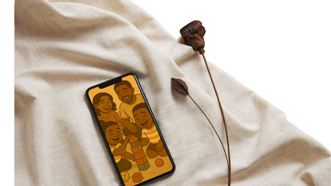
Feedback: “The flow felt very familiar from the first screen. It felt like I was on my phone. Though it took me a while, it made sense when I arrived at the final scene with the woman and kid.”
2nd attempt (moderated) Time: 1 minute and 15 seconds
Task Completition: easy to complete
Observation: very relaxed and explorative
Attitude: patient and intentional; understood the path but wanted to take the time to explore
Feedback: “It’s easy to navigate; the process to the end goal is straightforward; I like the use of icons, they are very descriptive and helpful in knowing what each tab does.”
-
![]()
Ronnie- 39 year old software developer
1st attempt (unmoderated) Time: 1 minute and 58 seconds
Task Completition: completed but with difficulty
Observation: curious, intrigued
Attitude: wants to fix things; wants to ask questions
Feedback: “It’s well designed; I can’t go back to previous screen. I was not able to understand where to click to get to the next screen. It would be nice to get an error message or direction to where to click so user knows the right path.”
2nd attempt (moderated) Time: 36 seconds
Task Completition: easy to complete
Observation: nodding in approval
Attitude: very relieved and impressed
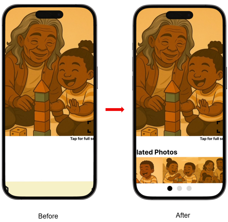
Feedback: “It’s very easy and simple. It gets the user to the end result. You should add a related photo section after the search results. That will enhance the user experience.”


Iteration
The usability testing provided insightful feedback. The first attempt was unmoderated to get a natural reaction from the participants. The second attempt was moderated with more context, and the participants were then able to understand the problem I was solving for and navigate effectively and intentionally. Overall, the feedback let me know that I was going in the right direction. Liz and Ronnie are much younger than our user persona, Nicole, who is not tech savvy. However, they loved the simplicity this provided. This reminded me of the concept of designing with a specific group in mind, and everyone else benefiting from the design. Valuable feedback came from Ronnie, who is a software developer. Based on his expertise and experience, he was very eager and wanted to fix things in the unmoderated attempt. His experience came from understanding what users prefer in this scenario. He suggested to add a list of related photos to the selected screen results for more options to the user in case they want to explore more photos.
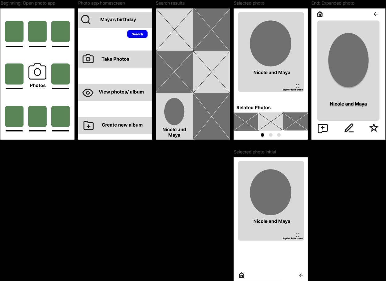
I made the iteration, and this is the final result.
View the high fidelity prototype.
Takeaways and next steps
This project helped me understand the value of really understanding the need of your users. Every step in understanding the users, from having a user persona to creating a user story was crucial. It helped me stay on track, whenever I thought I had a groundbreaking thought on what direction to go with the design. I had to pause and ensure that every decision was aligned with the goal statement, which was derived from a deep understanding of the pain points of the users. The goal was simplicity, and it was achieved based on the feedback from the usability testing.
The features I added to the prototype can be expanded for future projects and new user paths. On the full screen view of the selected photo, I added important features
1. The add new album option can give the user the option of adding the selected photo to an album, which makes it easier for the user to find their desired photo later on. This connects to the second user tab I created in the photo app home screen, “view photos/album.” This can be a new user path to expand on.
2. The edit button can provide the option to add captions and key words to the picture. This can be used in the next phase of development to link to the search results and provide more accurate search results. For example, adding the caption “Nicole and Maya at Maya’s birthday” will increase the chances of finding the desired picture when you type in “Maya’s birthday” in the search bar. This can be a user path for a future project.
3. The star button allows the user to bookmark certain photos they like and even create an additional folder, making it easier for users to find their desired pictures. This is another user path that can be expanded on.
The future projects that can be explored can all tie back to the 3-tab options I designed for the photo app home screen, during the information architecture phase. For this particular project, I focused on the path of searching for photos for the user.