
Parktix
Simplifying parking ticket payments and reducing user friction
Role
UX Designer (competitive audit, prototyping, visual design, interactive design, motion design, usability study)
Tools used
Figma: for UX Design (wireframes, prototypes, and design system)
Canva and Material Design: (Iconography and visuals)

Project goal
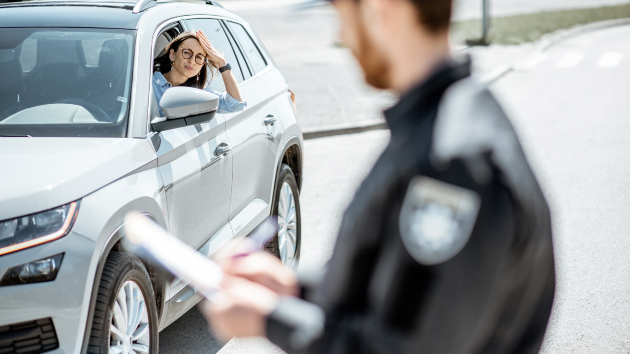
Getting a parking ticket can be disappointing and frustrating. I designed Parktix to simplify parking ticket payments and reduce user friction.
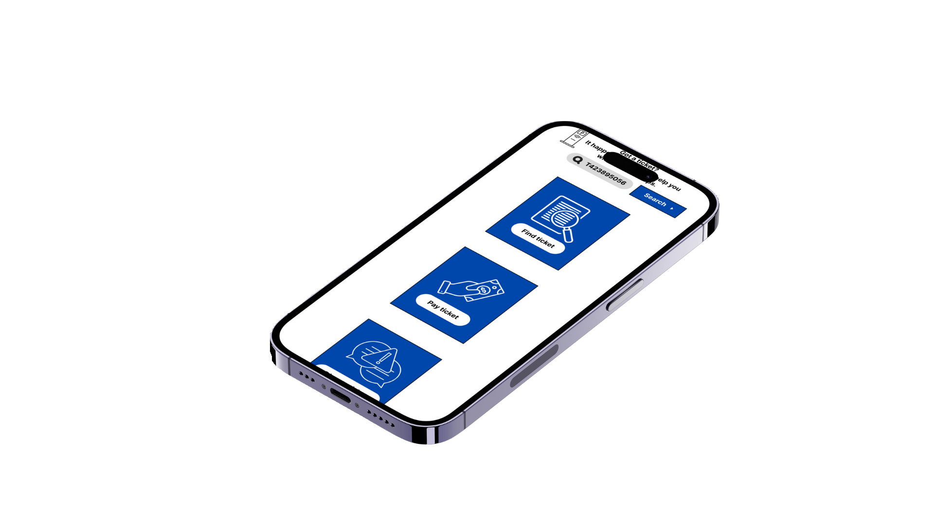
Key Decision: Consolidate user actions to 3 options
Tradeoff: Reduced unrelated features and any other alternative options in exchange for efficient and smoother task completion
Impact: Decreased friction, transaction time, and reduced abandonment during payment
Problem: Drivers have issues navigating parking ticket websites, finding the violation records, and completing payments to avoid late fees
Objective: Design a guided flow with an option of 3 actions to reduce cognitive overload and minimize checkout time and late fees
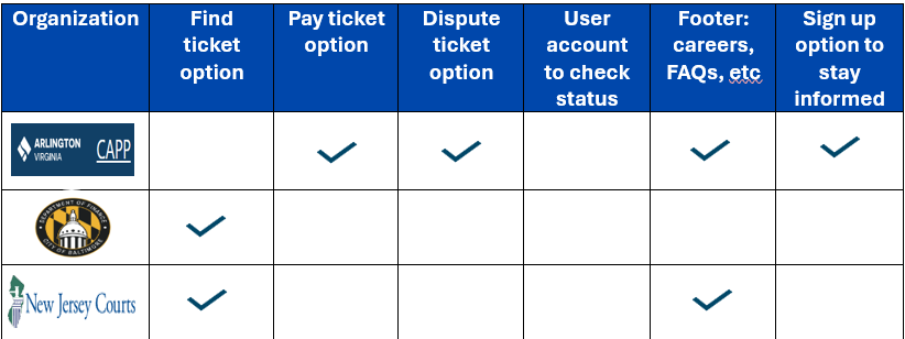
Competitive audit
My first step was to understand what some other ticket payment websites look like in terms of design and functionality. I did a competitive audit to understand some key focus areas that needed to be included in my design, and also get an idea of what works well and what does not work well. I looked at some ticket payment websites from a few counties across the country. Based on my findings below, I was ready to start the design process.
Design Process
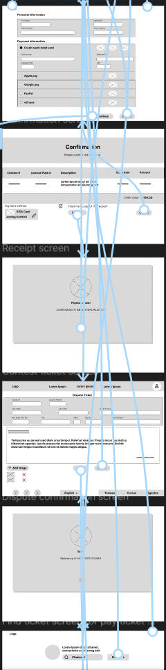
I started the design process with a sitemap to outline the structure and key areas of the website design.
Sitemap

Wireframes, Mockups, and Prototypes
Using the sitemap, I drafted some wireframe sketches for a responsive website, including a tablet and mobile version. Once the wireframe was drafted and I decided on the best version, I designed the low fidelity prototype, mockup, high fidelity prototype to design the vision I had for the project in Figma. During the process, I created a sticker sheet to facilitate developing the mockups and high-fidelity prototype. I ensured accessibility by using appropriate color contrast, font size, and white spaces. Since, Parktix is a responsive website, I started the phone app version of the website.


View the high fidelity prototype.


Usability study
Alex (31 year old male project manager)
“The website is simple and easy to navigate. I like that there isn’t too much words on each screen.”
Mary (29 year old female hairstylist)
“I like the visuals and spacing overall. Good color choice; the visuals help with understanding what to do and where to go.”
Takeaways and next steps
The saying, “it’s in the details” summarizes what I learned from this project. All the time spent on every single detail (icon, text, spacing, etc) led to a well-received outcome for users. I feel comfortable in my decision towards ensuring that my work is accessible, simple, and keeps the user and their goals at the forefront.
I started with the website, before starting the process for the mobile app version. I recently learned about the progressive enhancement approach to design, which means designing from the smallest screen to the largest screen. In this scenario, it would have been a better approach to start out with the mobile version first. Most users are likely to using a mobile phone when they want to pay their parking ticket fines.
The next steps would be to continue to build out the mobile app version. I added a bell icon for setting reminders on the ticket search screen. This is a feature to enable users add calendar reminders for their ticket fine due dates. This can be explored further. The user account profile can also be explored to find out status on disputed ticket fine requests.